You’d think it’d be easy for a big established brand to get its message, content, and products across to its target market with ease.
After all, these are brands attracting millions of visitors on a monthly basis to their website and companies that families depend on daily.
But you’d be surprised. Sometimes the biggest sites are the ones that find the most difficulty in keeping the brand’s standards high, attracting traffic and getting its message across on a consistent basis.
I’m a champion of consistency and believe the brand’s message should not only run throughout a website’s veins, but in everything it does.
I’ve been looking at some high profile branding examples lately of sites that lost a lot of traffic and sites that have won a lot of fans thanks to clear, creative communication.
Let’s start with…
The Bad…
The Metro’s mobile catastrophe
The Metro is one of the UK’s finest free daily digests and is published by Associated Newspapers Ltd. The Metro has managed to grow its audience over the years thanks to a fantastic blend of serious, informative journalism balance by quirky, unique stories that are fun to read.
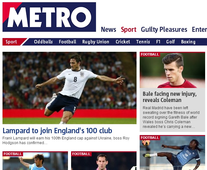
That same content can be found on the Metro site. However, despite the Metro’s successful content strategy, the owners launched a redesign in January (one of its busiest months) to align the site to a more mobile-centric future.
That led to an immediate 33.7 per cent drop in traffic, with a number of users accusing the site of being hard to navigate. Though the Metro is just about regaining traffic close to a year after the redesign, figures are still lower than they were before the redesign.
The problem? A tablet design on a desktop website. Though it might serve its purpose in the mobile world the Metro alienated a lot of its visitors by making its content hard to find and digest, stopping its most profitable feature from doing the talking.
The Good…
Dr. Martens and its fantastic history
Few sites offer all-round brand consistency as Dr. Martens. The iconic shoe manufacturer is proud of its heritage and works hard to promote it – alongside its products – through its website as much as possible.
YouTube videos of the company’s Cobbs Lane factory where its boots are made pepper the site as well as insights into the brand’s history, how Dr. Martens were adopted by punks, mods and other subcultures, and more.
Dr. Martens rightly lauds its history and its heritage which has helped to make it a household name. What’s noticeable though is that the messages featured on the site are also featured in-store. The brand message is at the focal point of everything Dr. Martens do.
The message is also spread through the company’s social responsibility mandate, its transparency, word of mouth and more. The site also features an easy-to-use checkout system, Beano tie-ins, tours and more.
And, of course, they sell shoes to die for!
The Bad…
HMV destroys its own web presence
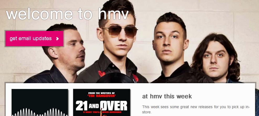
HMV’s problems are well documented after the high-street chain sank into administration, but its online problems have been evident for a while.
A few years ago the site was a technical minefield from a search perspective, with it competing against itself for a number of keywords and having a cluttered user experience. Masses of retail products crowded the site with prices being higher than a number of its online competitors.
Despite its faults HMV still had an online presence backed up by a global brand. Surely only a few tweaks were needed to set the site on the road to profitability?
Fast forward to today where consumers aren’t able to buy a single product through the HMV site. Instead it’s a husk of its former self, existing to drive footfall to its physical locations.
The fault lies with administrators Deloitte, with the company keeping stores open but (oddly) taking the online arm away.
‘Unfortunately we’re not currently in a position to offer an online shopping service, but we are working hard to bring you a new and improved hmv.com’ says the site’s official FAQ.
But surely with all of the brand’s woes some site is better than none at all?
The Good…
Ling’s Cars does it right
Remember Ling Valentine?
The quirky entrepreneur rocked into Dragons’ Den in 2006 showing pictures of her brand plastered across a rocket before turning down two offers and telling the investors that ‘Chinese eats dragon for breakfast’.
Ling’s popularity has exploded since then with Ling setting up LINGsCARS, offering car leasing, contract hire and more besides.
The real appeal of Ling though is that she’s managed to entirely integrate her personality into her brand and, though her site can take some getting used to and may appear cluttered, it’s all part of the charm.
Taking a look at some of the other sites in the leasing sector they all appear uniform. Ling has set out to break the mould with a fun brand that also offers visitors great value.
The brand’s unique sense of humour is evident from the off (with Ling’s enormous Darth Vader head being circled by cheap Audi deals), but other distractions such as games and live team webcams are there to help visitors buy into the overall Ling philosophy.
The theme stays consistent throughout, though. That Ling is looking to provide the best leasing deals around.
The lessons to learn
There are a huge number of other examples out there of brands performing well and others failing to translate themselves online.
But the most successful examples don’t just erect a website and wait for the money to roll in. As the Ling and Dr. Martens examples show giving customers something different and pushing the brand philosophy throughout the site can lead to real exposure and show off its creative side.
Customer engagement is essential when selling your brand online. Those visitors, after all, are the people who support your business and will help it grow.
To learn more about branding and effective web design contact Webpresence to find out more.


