

“Can you just pull me together a report that shows exactly what our marketing is doing for the board meeting at the end of the week?”
It’s barely 9am in the office on a Monday morning. You still have that mountain of unread emails, campaigns that need to go out, a problem with an event that’s on tomorrow and then your boss drops that bombshell.
You know the marketing you’re doing is great, he knows the marketing you’re doing is great, but now you need a report that shows all of that and you’ve got a tight deadline to get it ready. Where do you start?
It’s probably only a very small comfort to know that you’re not the only one with this problem. Despite the technology we have available, for every area of marketing, reporting remains a pain point for many marketers.
There’s always something new to report on, something else the boss wants analysis of, some new way of measuring the impact of what you’re doing.
Below you’ll find eleven of our best, meatiest, most actionable tips for producing great marketing reports. We’ve broken them down into ‘When’, ‘What’ and ‘How’ sections, to help you think about every aspect of your reports.
There’s tips on technology to use, how to structure what you produce and how to make sure that what you present is understood by those who will read or view it.
In a nutshell: it’s some of the best top-level guidance on marketing reporting we’ve picked up over the years.
So the next time the boss drops the Monday morning reporting bombshell: don’t worry! This guide will help you to show you’re the real marketing hero in your company.
Table of Contents
- When to report on your progress
- Think about time frames
- What to report on
- Consider Key Performance Indicators (KPIs)
- Introduce MQLs and SQLs
- How to structure and format your report
- Use the inbound methodology
- Structure your plan
- Think about the software
- Don’t abandon handouts
- The tools you could use
- Google Data Studio
- HubSpot Free
- Google Analytics
- Swydo
When to report on your progress
1. Thinking about time frames will help you to decide on an appropriate report
Your boss has asked for a report but he hasn’t said he wants to see year to date or for the last month: he just wants to know how the company’s marketing is going. In our scenario, what do you do now?
Whilst on occasion you might be asked for a specific report it’s surprisingly common for marketers to just be asked ‘for an update’. In this case deciding on the time frames you’re going to focus on will really help as a first step because it will give you some initial structure and point you in the right direction of the important data and tools that will help you.
Bear in mind here what’s going to be of most use to your audience. For some maybe last week’s email data is going to be exactly what they’re after. Others might need to see comparative traffic year-on-year.
Context is crucial when it comes to timescales. Consider the following two statements that could be included in your report:
“Our recent email achieved a 65% open rate and 32% click-through rate.”
“Our recent email achieved a 65% open rate and 32% click-through rate, both of these figures represent a 10% improvement on the email we sent out last week.”
If you’re thinking about your reporting before your boss has made that request then you’ve got some scope to consider what to do here. Would it be best for you to put together a real-time marketing dashboard that people can log on to when they need to? Or are more static reports likely to go down better and be used more effectively? Should they be daily, weekly or monthly? What about an annual report to summarise the year?
Bottom line: Start thinking about timescales and how they’ll affect what you do early in the process to bring clarity to your first steps.
What to report on
2. Understand your Key Performance Indicators (KPIs)
In the first instance it’s extremely important to understand what KPIs you and your role will be measured on.
If you were an electrician hired to fix a light the KPI would be easy: the light would work when the switch is flicked. Marketing is more difficult because there are so many more things that can be measured.
If you don’t know your KPIs then have a chat with your boss. It’s difficult to know for sure how well you’re doing in your job without clear measurement and expectation. Most great companies set clear expectations and targets for their employees and then support them in achieving them.
If the responsibility for choosing KPIs comes down to you then the inbound marketing methodology is a good place to start. Here’s a brief reminder on what the inbound methodology is if you need a refresher or haven’t come across it before. Depending on where your current focus is on the inbound methodology will depend which KPIs you want to monitor.
Consider the following for each stage;
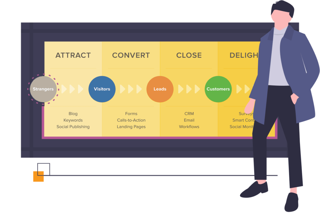
| Attract | Look at website sessions or unique visitors. You could also consider monitoring your organic traffic levels or your search engine rankings. It may also be useful to look at the split between new and returning visitors. |
| Convert | Monitor your conversion rates between lifecycle stages of your visitors and leads. Visitor to lead conversion rate and lead to MQL/SQL can be particularly useful. If you’re not familiar with MQLs and SQLs then point number 3 below has you covered! |
| Close | Look at the conversion rate from MQL to SQL and then SQL to Opportunity and Opportunity to Client. These can all be ‘close’ level KPIs. |
| Delight | The main way to measure how delighted your clients are is through something called your Net Promoter Score (NPS). NPS involves asking your clients a very simple question: How likely are you to recommend us to a family member or friend? The likelihood of this happening should be measured on a scale of 1-10, with 1 being bad. You are aiming for an average between 9 and 10. 9s and 10s are considered promoters. 7s and 8s are considered passive towards you. 6 and below are likely to be detractors of you, your brand or your product. |
Bottom line: Make sure your KPIs are known and use KPIs appropriate to the stage of the inbound methodology your marketing is focusing on.
3. Introduce MQLs and SQLs as a way of reporting marketing success (and much more!)
Marketing Qualified Leads (MQL) and Sales Qualified Leads (SQL) are a way of further segmenting and defining the leads you receive into the business. They can help you to report marketing success and further improve on your efforts to date. The below definitions should help to get you started.
| Lead | Any lead that comes into the business |
| MQL | A lead that meets a set of criteria agreed collectively by the marketing and sales teams, assessed by the marketing team. This criteria can often involve the lead having engaged with several pieces of marketing material and having passed some data to the company, which meets the target profile of the business. For example, to be an MQL, you may decide that a lead must have filled in a form on your website and that the information provided indicates that they are a decision-maker. |
| SQL | A lead that meets a set of criteria agreed collectively by the marketing and sales teams, assessed by the sales team. Sales teams will often assess MQLs for SQL fit by trying to place a phone call to the MQLs. A willingness to take the call is one sign that the lead matches the SQL definition. Sales would then try to supplement the information already gathered by marketing to decide if the lead is an SQL. |
Bottom line: implementing MQL and SQL definitions can help you to better assess your marketing by reporting lead, MQL and SQL numbers, rather than just overall lead volumes.
How to structure and format your reporting
4. Use the inbound methodology as a framework
We touched on the inbound methodology earlier as a way to help you decide what to report on. It’s also a very useful structure when it comes to deciding how you want to report marketing success.
The inbound methodology, at a basic level, can be explained to anyone in a very short period of time. Even if your whole business is not running on inbound you can explain your logic that each stage in the inbound journey is important to you as a marketer and you think you can improve each of them.
Imagine the misty-eyed look in your boss’ eyes during that presentation! Marketing meeting gold.
Set up your presentation or document with the major section headings of attract, convert, close and delight, with a one-sentence explanation of what each stage means.
Then within each section you can discuss what you’re doing to make your attract actions, for example, much better.
But you’re not stopping there, oh no, and that’s where the structure comes into its own. By moving on to the other stages you’ll not only have the chance to share all of the great content marketing metrics you’ve generated, you’ll also be showing your boss that you care about the end goal; getting more clients and then keeping them as clients for the long term.
Bottom line: The inbound methodology is a great structure to adopt for marketing reports and presentations, because it allows you to show off metrics from across the board and demonstrate your dedication to the end goal of the company. And that’s not all.
5. Structure your report so that it shows what you’ve done and what you plan to do
It’s tempting to think of a marketing report as a list of metrics that tells people the results of what you’ve been doing all this time… and that’s exactly what it is. But it can and should be much more than that as well.
Include in your report a checklist of the actions you’ve recently completed that are relevant to the metrics. So if you’ve recently changed the design on your email templates and you’re reporting an increase in click-throughs from your email marketing, explain that this probably happened because of the actions you took.
Equally, if something hasn’t worked include this as well. Most directors are well-versed in the fact that not all marketing works all of the time. Showing that you’re trying things to improve your marketing challenges, even if it didn’t come off this time, is a good thing to include.
You can then also include some empty check boxes next to actions you’re planning to complete between now and the time you next report or present on your marketing efforts. Again, this is essentially back to the days of ‘showing your working’. You’re demonstrating not only what the figures are currently, but what you’re doing to improve them.
Bottom line: This structure works really well when paired with the inbound methodology structure. For each section you can show the figures, what you did to get them where they are and what you’re going to do to improve them further.
6. Using good old Powerpoint (or Google Slides) for your marketing report
There’s nothing at all wrong with sticking to what you know and using Powerpoint, Google Slides, Word or any other regularly available software to build, publish and share your marketing report.
Presentation softwares like Prezi have as many detractors as they do advocates and you may not have the budget to go out and get specialist marketing reporting software. Sometimes the easy choice is also the best choice. On the other hand, if you are into fancy visuals, there are other presentation tools available for free, like the Visme Report Maker.
Hopefully you already know the golden rules of Powerpoint, but just in case here’s our version of them (there’s more from HubSpot here);
- Don’t cram in too much text; a few bullet points or paragraphs per slide, at most.
- Leave lots of empty space around text or graphs to make your slides easier on the eye.
- Go for short, bold messages. Anything that needs to be read can be an appendix at the back: don’t present this!
- Don’t read what’s on the slides if you’re presenting. You should talk through information that adds to what’s there, not just repeat it.
- Keep your slides on-brand; you’re part of the marketing department after all so make sure you’re not changing the logo from red to green on a whim!
Bottom line: If your report suits Powerpoint slides or a nicely formatted Word document then don’t spend too much time overthinking it. There’s plenty of other things to be getting on with.
7. Don’t abandon handouts or something else more tangible
Your boss has seen Powerpoint slides before (everyone has seen Powerpoint slides before), so whilst it’s fine to stick with them as the main vehicle to deliver your data, don’t abandon ideas of doing something different in addition to your Powerpoint, if you have time.
Handouts of key data points or summaries can really help to cement your message in your audiences’ minds and they’re particularly useful if you need your audience to go away and think about something (like signing off an increased budget).
You could also do the modern equivalent of a handout; a marketing dashboard that people can review later. There are various data solutions available for this at a cost but there are also solutions such as Google Data Studio (see below), which are available for free.
Bottom line: Make sure you have the time to do it (the substance of your presentation is more important), but don’t abandon the idea of doing something creative to stand out.
What tools can help you to produce your marketing reports (for free or limited cost)
8. Google Data Studio is your new best friend
Google Data Studio came out of beta mode in October 2018 and has been around in some form since 2016.
It’s an incredibly useful tool yet there are still many marketers who don’t really know it exists or feel it’s too advanced for their needs. If this is you: don’t worry! Discovering Google Data Studio now will revolutionise how you view your marketing data and there’s plenty of guides and expertise available to help you to get the most out of its advanced functions.

The trick to thinking about Data Studio is to remember there’s two sides to it; the side you’ll use and the side your boss and the board will see. The side you’ll use takes a bit of learning and getting used to. The side your boss will see can be thought of as Google Analytics for Dummies (but don’t label it like this for your boss).
That’s because what Data Studio does is take your Google Analytics data and allow you to build it into easier-to-digest dashboards, complete with options to label or explain the various reports and graphs that you use.
Over time Analytics has grown into a bit of a behemoth and anyone unfamiliar with what they’re looking at can quickly get lost. Data Studio allows you to take it back to basics, presenting the data in a more ‘casual user’ friendly way.
Real time dashboards from Google Analytics data
The dashboards you produce are designed to be real time, so your boss can log on and see what’s happening for himself. But there’s no reason why you can’t snip the graphs out to go into a more traditional presentation.
As we mentioned above, you can even use both methods; put the graphs into a presentation and highlight that the data is there for anyone who wants to dig into it themselves.
Once you’ve built your first dashboards on Analytics data you can get into the advanced functions of Data Studio. There are pre-built connections to other data sources available, for example and you can also create custom connections through Google Sheets or alternatives.
Bottom line: Data Studio is a hugely powerful tool for presenting your marketing data. Get started with the basics and graduate to the advanced functions in time
9. HubSpot’s free (and automatically shared) sales and marketing dashboards
HubSpot Free is just that: a freemium version of HubSpot’s advanced sales and marketing tools, featuring a fully functioning CRM and, most importantly for you in your reporting situation: two moden reporting dashboards focused on sales and marketing activity.

Each dashboard can feature up to 10 individual reports, focusing on a different aspect of your marketing.
The more you use the tools available in HubSpot the more you’ll be able to report on, but even if you don’t use HubSpot for things like your email marketing or sales pipeline management there’s plenty of useful data you can display. This is because, like Data Studio, HubSpot can link with your Analytics, pulling your data into a friendlier reporting format for the non-marketer.
There’s another advantage to using HubSpot as well. The simple ‘share’ feature allows you to set your dashboards up to regularly send the data, via email, to your colleagues. When your boss asks ‘can you put me together a marketing report?’, you can answer, ‘yes and would you like me to set it so that it’s in your inbox every Friday at 9am?’ It’s a very powerful addition to your marketing arsenal.
Bottom line: There are plenty of useful tools in HubSpot Free. Signing up for the dashboards and ‘share’ functionality alone is worthwhile for your reporting needs.
10. Using Google Analytics… appropriately
We’ve mentioned Google Analytics plenty of times in this article, and with good reason. In all likelihood it is still the main source of marketing data you have. It’s free, it’s simple for a web developer to connect with your website and it rarely breaks to a terminal degree. The data it produces is likely to include data which contributes to assessing your KPIs.
Unfortunately the challenges with Analytics are also well known to most marketers. It can be difficult to get to the exact data that you need, it’s easy to disappear for days down an Analytics rabbit hole and the reports it produces aren’t particularly user- friendly for non-users (although the most recent makeover has taken strides to fix that).
There are plenty of ways to use Analytics that will help you to make the data more useful for your board. We’ll cover just two of them here.
- Spend time finding what you need and pull it out of Analytics – if you’re using PowerPoint or similar for your report then keep everything in there, skirting the issue of forcing non-Analytics users to get used to a system that can be problematic to start with. Use screen captures to pull the data you’ve found, filtered and organised into your report; they never need to see the inside of Analytics!
- Spend time learning custom dashboards – like Data Studio, custom dashboards in Analytics are underused by most marketers. Investing some time on learning how to create them will save you time in the future. Instead of having to redo appropriate filters each time you need a report you can build your ideal ‘front page’ and leave it there for all time.
Bottom line: Analytics is likely to remain your most useful tool for generating marketing reports, but keep in mind it is a tool for you. You’ll need to make the data it gives you palatable for your non-marketeer audience.
11. Consider a more flexible reporting solution, like Swydo
There are plenty of substantial reporting solutions out there, which accept input from multiple sources, which you may want to consider. Before you do this it’s worth considering the following questions;
- Do you have a budget for additional software? Many of the solutions available above the ones we have already discussed will have licence fees. If you’re going to struggle to get the budget for them in the time you have available then it’s probably best to accept you’re limited to what you have and get going.
- Do you really need something more than Data Studio and the other ‘free’ options? There’s a lot that you can do with Analytics, Data Studio and other options like HubSpot. Whilst there’s some great solutions available, are they definitely what you need here? Bear in mind you might need to create a business case for them.
If you do decide to go for something more advanced then Swydo is a good option. It features branded reports and can look into your data when it comes to PPC, SEO and social media, as well as pulling in third party data from platforms like MailChimp and SalesForce.
Other reporting tools are available, but this is a great place to start for those with more advanced needs.
Bottom line: Make sure you have the budget and use case for an advanced tool, but if you do need one you can take your reporting to the next level with a bit of time invested.
